Flexboxで横並び
<html lang="ja">
<head>
<meta charset="UTF-8">
<meta name="viewport" content="width=device-width">
<title>Flexboxで横並び</title>
<link rel="stylesheet" href="css/style.css">
</head>
<body>
<div class="wrapper">
<div class="box">
<img src="img/01.jpg" alt="">
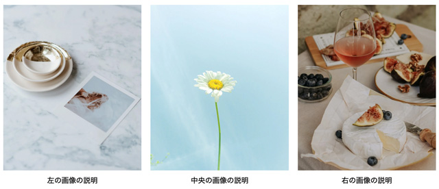
<p>左の画像の説明</p>
</div>
<div class="box">
<img src="img/02.jpg" alt="">
<p>中央の画像の説明</p>
</div>
<div class="box">
<img src="img/03.jpg" alt="">
<p>右の画像の説明</p>
</div>
</div>
</body>
</html>
- gapを指定した場合は、flexアイテムの幅指定は不要
@charset "UTF-8";
* {
margin: 0;
padding: 0;
box-sizing: border-box;
}
ul, li {
list-style: none;
}
img {
max-width: 100%;
vertical-align: bottom;
}
body {
color: #333;
font-size: 16px;
font-family: Arial, sans-serif;
line-height: 1.7;
}
.wrapper {
display: flex;
gap: 20px;
max-width: 960px;
margin: 50px auto;
}
.box {
text-align: center;
}
.box > img {
margin-bottom: 10px;
}
- justify-content: space-between; でgap指定がない場合は幅指定が必須
.wrapper {
  display: flex;
  justify-content: space-between;
  max-width: 960px;
  margin: 50px auto;
}
.box {
  width: 32%;
  text-align: center;
}